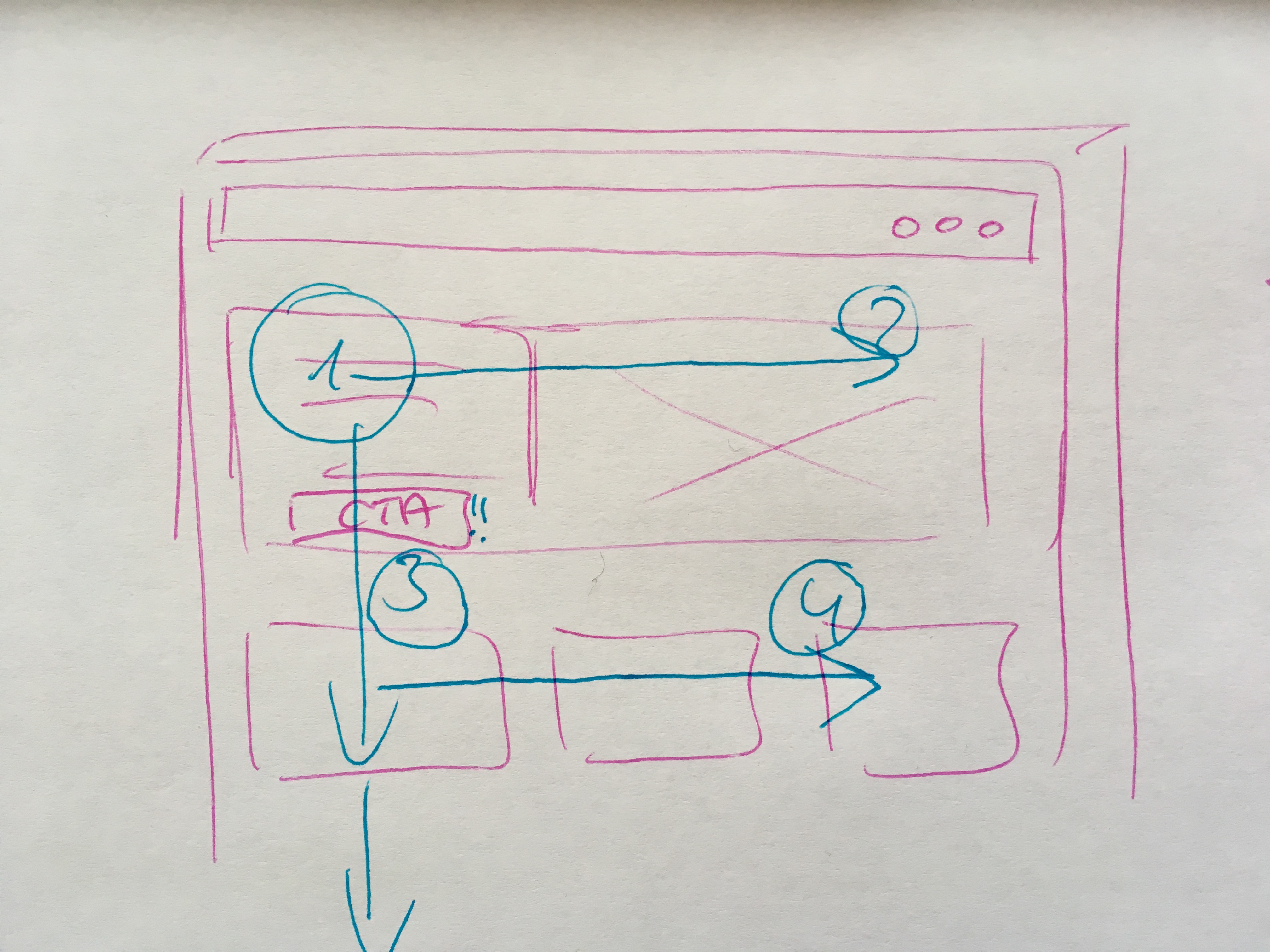
A lot of eyetracking studies showed – most of them were performed by Jacob Nielsen – that people tend to follow an F-shaped reading pattern when looking at different types of web pages: two horizontal stripes followed by a vertical stripe.This means, that people don’t necessarily see everything (equally) even if that information is put in front of them.
So here are three key principles we should keep in mind when designing web pages which can help to guide us towards delivering better user experiences because they take advantage of that knowledge:
1) Valuable and important information and actions should be clearly visible: Information that is not immediately visible and perceivable by people is less likely to be noticed. Plus: if there is an extra effort required to find it, the number of people that will find it and take action on it is gonna be reduced significantly.
2) When designing, keep the F-Shape in mind
Take advantage of this F- shaped reading pattern that people tend to pursue when they visit a webpage and place the most valuable information and elements by following this pattern.
3) Even when testing, always question why people did not find the information
When evaluating a webpage through user testing or an expert review, and people (or in case of an expert review: you) missed some important information: ask yourself always critically: did people actually see this information and they ignored it because it seemed not relevant to them for some reason or did they miss it completely because they followed the F-shaped reading pattern and the information was not placed by taking advantage of that pattern?
So, as we see we can clearly taking advantage of the knowledge how people read through a page when designing these or conducting evaluations.