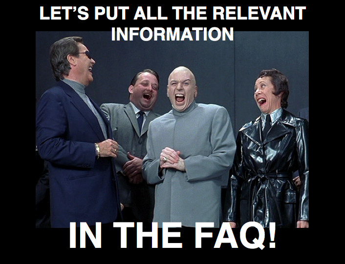
FAQ pages usually contain a set of questions with prefilled answers which the service provider estimates users will come up often with when using the service and which should be looked at first before people are going to contact customer support.
Hopefully, the FAQ provides real frequently asked questions or at a minimum questions which are – like already mentioned – expected as questions users will come up with and not happy marketing SEO talk.
Usually such a FAQ collection is structured as a list, perhaps seperated by different topics somewhere on the webpage. Users which have questions are forced to scan through this non-contextual list, which could be very long and result in a confusing and frustrating experience.
So, a question which is asked frequently shows the simple fact, that there is a significant number of people who are interested in or seeking this or similar information and can’t find the information in the place they expect it on the website. In other terms, it’s valuable information for users or customers. Site Visitors or customers sitting in front of a web site with questions expect quick solutions for their problems and want to get quick answers to their questions.

Why is this valuable information hidden that often deep inside the FAQ closet of doom, miles away from the place it belongs to?
It’s okay to have a FAQ Page or section – but please show relevant content grouped contextually, even if its redundant and is answered in your FAQs too.
For example, provide the link „How to delete my account“ in the users account section and not miles and hours of scrolling away from it – exclusively and only inside the FAQ section. (Perhaps putting a password on it, too, so nobody ever will access it?) ;)
In this example, we even deal with a lack of transparency – „They hide it because they do not want me to find it!“ – which leads to lack of confidence and finally to frustration and a negative image. Frustration leads to unsatisfied users, which will talk about the bad experience they made.
Why is this content not placed somewhere where it’s contextually relevant?
Why have the site visitors or users do all the „work“ to find out how they can solve a particular problem?
This is bad customer service. It’s the same as if you walk into a bar and all the service people will hide from you immediately — „Sorry, nobody here for any help, we hate customers.“
What would you do? :)
If we show relevant information and offer help at the places where people expect it, it shows people that we care about their questions and needs. This leads to a better customer experience in the long run and it could be easily be achieved with a little bit of content strategy, offering help and cooperativeness instead of simply ignoring your users needs and questions.
People think in categories and are looking for information based on those categories, so it’s good advice to follow the mental models/thinking of people and show them the valuable information they are looking for contextually.
Content should always be grouped with other content of a similar topic in a place where it is contextually relevant, where people expect it and it should always be well and clear labeled.
If we want to have happy users or customers we have to think about how to provide this help and cooperativeness aka good customer service instead of providing problems, a Carol Beer attitude (see video below) and forcing them to put effort in finding the correct answers by themselves.